Ford Gobike
Swapnil
San Fransisco Bay Area Bike Share Data Analysis
Exploratory data analysis of SF Bay area Fordgobike bike share data.
1. Introduction

SF Bay area bike share is a service that provides an easy, affordable and environment-friendly mode of commute in the SF Bay area. The data can be analysed to find out hidden patterns.
Following are the major questions that can be answered from the given data :
- Does the utilization of bike stations change during different times of the day?
- Is the service more utilized in some cities than others?
- Are some of the stations under or over utilized?
- Can we suggest changes in the station dock capacity?
- Can we suggest additional stations in the area?
- How does weather impact the way people avail bike share service?
- Any other unforeseen findings?
I plan to clean, aggregate, summarize and visualize the data as and when required for the analysis. The geographical analysis will be done to identify location-based patterns.
The analysis will help:
- Identify over and underutilized stations and deploy new or remove stations accordingly
- Plan pricing strategy e.g. introducing happy hours with discounted bike rent during non-peak hours/days
- Identify cities where more marketing efforts are required to improve service utilization
2. Packages Required
Following is the list of packages that are required for the project. A brief description of the reason behind using the package is written in comments.
library(data.table) # For faster reading of large data
library(leaflet) # For geographical maps and analysis
library(sqldf) # For writing SQL join statements in the code
library(dplyr) # For data manipulation
library(plotly) # For interactive plots
library(stringr) # For string related operations
library(lubridate) # For date related operations
library(fasttime) # For changing datetime format fast
library(tidyr) # For creating tidy data
library(gridExtra) # For showing graphs in grids
library(DT) # For rendering R objects as HTML
3. Data Preparation
The data used for this project is taken from Kaggle. Fordgobike regularly releases data relating to bike sharing and this data has been transformed by Kaggle team for the analysis. The data under the discussion is gathered over the period of three years - 2013,2014,2015. Original dataset and the description can be found here
3.1. Description of data
The data has following four tables-
Station- Data relating to the geographical location of 70 bike stations, their id, name, city, installation date and dock count. It has 70 observations and 7 variables.
Status- Time series data relating to bikes and docks available for each station. This table has 71984434 observations and 4 variables.
Trip- This table has data related to each trip over the three years. This table has 669959 observations and 11 variables.
Weather- This table has data relating to daily weather conditions of each city over the three years. It has 3665 observations and 25 variables.
3.2. Importing Data
The origina data has been imported from Kaggle and loaded into the dataframes. Below is the glimpse of original datasets.
datatable(head(station,10))datatable(head(status,10))datatable(head(trip,10))datatable(head(weather,10))3.3. General Formatting
After initial analysis of the data, it has been observed that the data needs to be cleaned and formatted for analysis. Following changes have been identified for each of the datasets.
Missing Values- Checking missing values in each of the datasets.
Station- In Station dataset installation_date needs to be changed from character to date format in the default time zone.
Status- Need to change the format of time variable in the status dataset to POSIXct. We need to change this so that we can perform time-related operations on the data.
Trip- Need to change the format of start_date and end_date variables in the trip dataset to POSIXct so that we can aggregate the data based on time.
- Weather-
Precipitation column in weather dataset is char and has value ‘T’. According to Weather Underground, ‘T’ stands for Traces of precipitation, which is used when precipitation has been detected, but it isn’t sufficient to measure meaningfully. For the analysis, we need to change precipitation to a small number changing T to 0.01 and change the datatype to numeric so that the value can be compared with other precipitation related information.
There are two ways the event of Rains has been captured- Rains and rains. We need to keep Rains (with capital R) for both.
Finally, blank events are coded as Normal Day assuming that no special weather-related event occurred on that day.
station$installation_date <- mdy(station$installation_date)
status$time <- fastPOSIXct(status$time,tz="America/Chicago")
trip$start_date <- mdy_hm(trip$start_date,tz="America/Chicago")
trip$end_date <- mdy_hm(trip$end_date,tz="America/Chicago")
weather$date <- mdy(weather$date,tz="America/Chicago")
From below results, we can observe that only Weather dataset contians missing values. However, we do not delete or impute the missing values yet.
weather$precipitation_inches[weather$precipitation_inches=='T']<-0.01
weather$precipitation_inches<-as.numeric(weather$precipitation_inches)
weather$events[weather$events=='rain']<-"Rain"
weather$events[weather$events=='']<-"Normal Day"
colSums(is.na(station))
## id name lat long
## 0 0 0 0
## dock_count city installation_date
## 0 0 0colSums(is.na(status))## station_id bikes_available docks_available time
## 0 0 0 0colSums(is.na(weather))## date max_temperature_f
## 0 4
## mean_temperature_f min_temperature_f
## 4 4
## max_dew_point_f mean_dew_point_f
## 54 54
## min_dew_point_f max_humidity
## 54 54
## mean_humidity min_humidity
## 54 54
## max_sea_level_pressure_inches mean_sea_level_pressure_inches
## 1 1
## min_sea_level_pressure_inches max_visibility_miles
## 1 13
## mean_visibility_miles min_visibility_miles
## 13 13
## max_wind_Speed_mph mean_wind_speed_mph
## 1 1
## max_gust_speed_mph precipitation_inches
## 899 1
## cloud_cover events
## 1 0
## wind_dir_degrees zip_code
## 1 0colSums(is.na(trip))## id duration start_date
## 0 0 0
## start_station_name start_station_id end_date
## 0 0 0
## end_station_name end_station_id bike_id
## 0 0 0
## subscription_type zip_code
## 0 03.4 Advanced Formating
It has been observed that the values in the duration column do not match with the time difference between start_date and end_date. Since trip start and end times are most likely to be taken from station sensors, they can provide more reliable data. Thus, we have added trip_durtation column, which is the difference between trip end time and start time in minutes. We can drop the original column duration. Summary of trip duration is below-
trip$trip_duration <- as.numeric((trip$end_date-trip$start_date))
trip$duration <- NULL
summary(trip$trip_duration)
## Min. 1st Qu. Median Mean 3rd Qu. Max.
## 1.00 6.00 9.00 18.47 13.00 287839.00As we can see the maximum duration of a trip is 287899.00 minutes which is highly unlikely. According to Ford Bike share, pricing information available here, day passes up to 72 hours are available. It is likely that people taking a 3-day pass might extend their pass for a day or two. So, I have assumed any duration beyond 5 days (\(7200-Minutes\)) as an outlier.
Removing the outliers from trip dataset.
trip = trip[trip$trip_duration < 7201,]
summary(trip$trip_duration)
## Min. 1st Qu. Median Mean 3rd Qu. Max.
## 1.00 6.00 9.00 17.59 13.00 7157.00For analysis, we need to:
- Add longitude and latitude columns in the status and the trip datasets
- Create a new dataset tripFinal that contains latitudes and longitudes of source and destination of each trip and delete original trip dataset to save memory.
- Change the zip_code in tripFinal dataset to integer
- Remove observations with invalid zipcodes and add city names to weather and trip datasets
colnames(station)[1]<-"station_id"
# Getting latitude and longitude of each station for the trips data
trip1 <- sqldf('select trip.*,station.lat as source_lat,station.long as source_long from trip
               left outer join station
               where trip.start_station_id = station.station_id')

tripFinal <- sqldf('select trip1.*,station.lat as dest_lat,station.long as dest_long from trip1
                   left outer join station
                   where trip1.end_station_id = station.station_id')
rm(trip,trip1)

# List of valid zipcodes for each city
MountainView<-c(94039,94040,94041,94042,94043,94085,94303)
RedwoodCity<-c(94002,94061,94062,94063,94064,94065,94070)
SanFrancisco<-c(94102,94104,94103,94105,94108,94107,94110,
                94109,94112,94111,94115,94114,94117,94116,
                94118,94121,94123,94122,94124,94127,94126,
                94129,94131,94133,94132,94134,94139,94143,
                94151,94159,94158,94188,94177)
PaloAlto<-c(94022, 94040, 94043, 94301, 94303, 94304,
            94305, 94306, 95014, 95033)
SanJose<-c(94089, 95002, 95008, 95013, 95014,
           95032, 95035, 95037, 95050, 95054,
           95070, 95110, 95111, 95112, 95113,
           95116, 95117, 95118, 95119, 95120,
           95121, 95122, 95123, 95124, 95125,
           95126, 95127, 95128, 95129, 95130,
           95131, 95132, 95133, 95134, 95135,
           95136, 95138, 95139, 95140, 95148)

# Removing invalid zipcodes and addding city name based on the zipcode
validZipCodes<-c(MountainView,RedwoodCity,SanFrancisco,PaloAlto,SanJose)
tripFinal<-filter(tripFinal,zip_code %in% validZipCodes)

tripFinal$city<-ifelse(tripFinal$zip_code %in% MountainView,'Mountain View',
                       ifelse(tripFinal$zip_code%in% RedwoodCity,'Redwood City',
                              ifelse(tripFinal$zip_code%in% SanFrancisco,'San Francisco',
                                     ifelse(tripFinal$zip_code%in% PaloAlto,'Palo Alto','San Jose'))))

weather$city<-ifelse(weather$zip_code %in% MountainView,'Mountain View',
                     ifelse(weather$zip_code%in% RedwoodCity,'Redwood City',
                            ifelse(weather$zip_code%in% SanFrancisco,'San Francisco',
                                   ifelse(weather$zip_code%in% PaloAlto,'Palo Alto','San Jose'))))
3.5. Cleaned Data
Here is the glimpse of cleaned data.
datatable(head(station,10))datatable(head(status,10))datatable(head(tripFinal,10))datatable(head(weather,10))4. Exploratory Data Analysis
4.1. Station
1. Citiwise stations and their dock count- It can be observed that on average San Francisco has the highest number of stations in each category of dock count.
x <- list(
  title = "Dock Count"
)
y <- list(
  title = "Frequency"
)
p <- plot_ly(x = ~station$dock_count,color = station$city)%>%
  layout(
    title = "Dock count by cities",
    xaxis=x,yaxis=y,
    updatemenus = list(
      list(
        y = 1,
        buttons = list(

          list(method = "restyle",
               args = list("type", "histogram"),
               label = "Histogram")
          ))
    ) )
p
2. Geographical analysis of each of the station and the dock count.
Each circle in the map represents a station, darker the colour, more the dock count for that station. Hovering the map will reveal station name and the dock count for that station.
As we can observe, San Francisco has more stations with high dock counts.
#plotting each station geographically
stationLabel<-paste0(station$name,", Docks:",station$dock_count)
pal <- colorNumeric(c("Reds"), station$dock_count)

leaflet(data = station) %>% addProviderTiles("CartoDB.DarkMatter") %>%
  addCircleMarkers(~long, ~lat, radius = 5,
                   color = ~pal(dock_count),
                   fillOpacity =0.2,weight=1,label=stationLabel)
4.2. Trip
1. First we analyse trip dataset based on the duration.
summary(tripFinal$trip_duration)## Min. 1st Qu. Median Mean 3rd Qu. Max.
## 1.00 5.00 8.00 12.93 12.00 6755.00As we can see, 75% of the trips have a duration between 1 and 13 minutes. We can divide the dataset into three sets:
- Short (trip duration < 14 minutes)
- Medium (trip duration between 14 and 24 hours)
- Long (trip duration >24 hours)
We observed that there were no observations in tripMedium dataset, so we dropped that dataset. We can now analyse trip duration of short and long trips.
As we can observe below, for Short Trips the maximum number of trips are between 5 to 10 minutes and the count decreases for longer durations. For Long Trips, the number of trips steadily decreases as the duration increases.
d1<-density(tripShort$trip_duration)
d2<-density(tripLong$trip_duration)
p <- plot_ly() %>%
  add_trace(type = 'histogram', name = 'Short Trips',nbinsx = 60,opacity=0.3,
            x = tripShort$trip_duration, visible=T, marker = list(color = 'black'))  %>%
  add_trace(x = d1$x, y = d1$y, type = "scatter", mode = "lines", fill = "tozeroy", yaxis = "y2", name = "Density",visible=T) %>%
  add_trace(type = 'histogram', name = 'Long Trips',nbinsx = 200,opacity=0.3,
            x = tripLong$trip_duration, visible=F, marker = list(color = 'black')) %>%
  add_trace(x = d2$x, y = d2$y, type = "scatter", mode = "lines", fill = "tozeroy", yaxis = "y2", name = "Density",visible=F) %>%
  layout( title="Histogram of the trip duration",
          xaxis = list(title = "Trip Duration"),
          yaxis = list(title = "Frequency"),
          yaxis2 = list(overlaying = "y", side = "right"),
          updatemenus = list(
            list(
              yanchor = 'auto',
              buttons = list(
                list(method = "restyle",
                     args = list("visible", list(T,T,F, F)),
                     label = 'Short Trips'),

                list(method = "restyle",
                     args = list("visible", list(F,F,T,T)),
                     label = 'Long Trips')
              ))))
p
2. Weekdays Vs. Weekends for each city
Now, we need to analyse whether the number of trips differs significantly for each city on weekdays as compared to weekends.
We see a clear distinction between weekdays and weekends in terms of the number of trips taken. As expected, San Francisco has the highest number of trips on average, followed by San Jose
It is worth noting that the number of weekday trips has been steadily increasing, the weekend trips are decreasing for San Francisco and San Jose
tripsperday<-tripFinal%>%group_by(as.POSIXct(strptime(tripFinal$start_date,"%Y-%m-%d")),city)%>%summarise(DailyTrips=n())
colnames(tripsperday)<-c('date','city','DailyTrips')

# Joining weather details and the number of trips for each day/each city

tripAnalysis <- sqldf('select tripsperday.DailyTrips,weather.* from tripsperday
                      inner join weather
                      where weather.date  = tripsperday.date and
                      weather.city=tripsperday.city')


tripAnalysis$day<-format(tripAnalysis$date, "%u") %in% c(6, 7)
tripAnalysis$day<-ifelse(tripAnalysis$day,'weekend','weekday')

# plotting weekday vs weekend trips for each city
p1<-ggplot(data = filter(tripAnalysis,city=='Mountain View'),aes(x = date,y = DailyTrips,color=day))+geom_point(alpha=0.2)+geom_smooth()+labs(title='Mountain View')
p2<-ggplot(data = filter(tripAnalysis,city=='Palo Alto'),aes(x = date,y = DailyTrips,color=day))+geom_point(alpha=0.2)+geom_smooth()+labs(title='Palo Alto')
p3<-ggplot(data = filter(tripAnalysis,city=='San Jose'),aes(x = date,y = DailyTrips,color=day))+geom_point(alpha=0.2)+geom_smooth()+labs(title='San Jose')
p4<-ggplot(data = filter(tripAnalysis,city=='Redwood City'),aes(x = date,y = DailyTrips,color=day))+geom_point(alpha=0.2)+geom_smooth()+labs(title='Redwood City')
p5<-ggplot(data = filter(tripAnalysis,city=='San Francisco'),aes(x = date,y = DailyTrips,color=day))+geom_point(alpha=0.2)+geom_smooth()+labs(title='San Francisco')


grid.arrange(p1,p2,p3,p4,p5,nrow=3)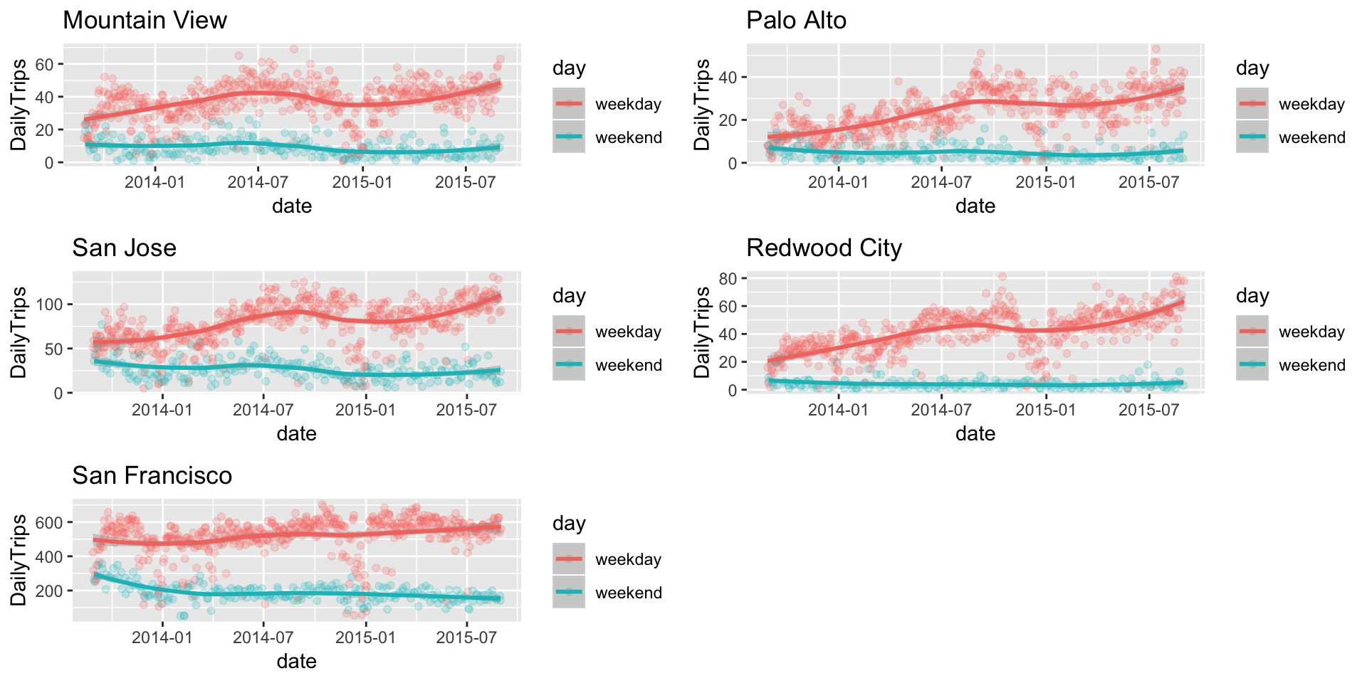
3. Time-based analysis
Now, we need to analyse the number of trips based on hour, day, month and year. This graph will give us a holistic view of the number of trips. To achieve this, we create hourly, daily, monthly and yearly trip statistics for comparison. We will consider, trip start_time as the time base for this analysis.
As we can observe in hourly trips graph, peak hours are between 7 AM to 10 AM and 4:30 PM to 7 PM. In monthly trips graph, it can be seen that least number of trips are in December and the number jumps back in January.Festive holidays can be one of the reasons for this seasonal drop in trips.
# Pulling out time,day,month and year from single column and using it for analysis

tripNew<-separate(tripFinal,start_date,c("Sdate","Stime"),sep = " ")%>%
  separate(end_date,c("Edate","Etime"),sep = " ")%>%
  separate(Edate,c("Eyear","Emonth","Eday"),sep = "-")%>%
  separate(Sdate,c("Syear","Smonth","Sday"),sep = "-")%>%
  separate(Stime,c("Shour","Sminute","Ssecond"),sep = ":")%>%
  separate(Etime,c("Ehour","Eminute","Esecond"),sep = ":")

# We add city names based on the zipcode
tripNew$city<-ifelse(tripNew$zip_code %in% MountainView,'Mountain View',
                     ifelse(tripNew$zip_code%in% RedwoodCity,'Redwood City',
                            ifelse(tripNew$zip_code%in% SanFrancisco,'San Francisco',
                                   ifelse(tripNew$zip_code%in% PaloAlto,'Palo Alto','San Jose'))))

# created separate datasets for hourly,daily,monthly and yearly data

tripYearly<-tripNew%>%group_by(Syear,city)%>%summarise(count=n())
tripMonthly<-tripNew%>%group_by(Smonth,city)%>%summarise(count=n())
tripDaily<-tripNew%>%group_by(Sday,city)%>%summarise(count=n())
tripHourly<-tripNew%>%group_by(Shour,city)%>%summarise(count=n())

tripYearly$Syear<-as.integer(tripYearly$Syear)
tripMonthly$Smonth<-as.integer(tripMonthly$Smonth)
tripDaily$Sday<-as.integer(tripDaily$Sday)
tripHourly$Shour<-as.integer(tripHourly$Shour)

# Plotting an interactive barplot

p <- plot_ly() %>%
    add_trace(type = 'bar', name = 'Hourly Trips',opacity=0.3,x=tripHourly$Shour,
            y = tripHourly$count, visible=F, marker = list(color = 'black')) %>%
    add_trace(type = 'bar', name = 'Daily Trips',opacity=0.3,x=tripDaily$Sday,
            y = tripDaily$count, visible=F, marker = list(color = 'black'))  %>%
    add_trace(type = 'bar', name = 'Monthly Trips',opacity=0.3,x=tripMonthly$Smonth,
            y = tripMonthly$count, visible=F, marker = list(color = 'black')) %>%
  add_trace(type = 'bar', name = 'Yearly Trips',opacity=0.3,x=tripYearly$Syear,
            y = tripYearly$count, visible=T, marker = list(color = 'black'))  %>%
layout( title="Barplot of the trip count",
          yaxis = list(title = "Trip Count"),
          updatemenus = list(
            list(
              yanchor = 'auto',
              buttons = list(
                list(method = "restyle",
                     args = list("visible", list(F,F,F,T)),
                     label = 'Yearly'),

                list(method = "restyle",
                     args = list("visible", list(F,F,T,F)),
                     label = 'Monthly'),

                list(method = "restyle",
                     args = list("visible", list(F,T,F,F)),
                     label = 'Daily'),

                list(method = "restyle",
                     args = list("visible", list(T,F,F,F)),
                     label = 'Hourly')
              ))))

p- Are some bikes more used than others?
As we can see in the below plot, the bikes that have IDs between 250 and 700 are most used. This could be because of the fact that these bikes belong to highly utilized stations.
tripsperbike<-tripFinal%>%group_by(bike_id)%>%summarise(TripCount=n())
ggplot(data=tripFinal,aes(x = bike_id))+geom_density(color='orange')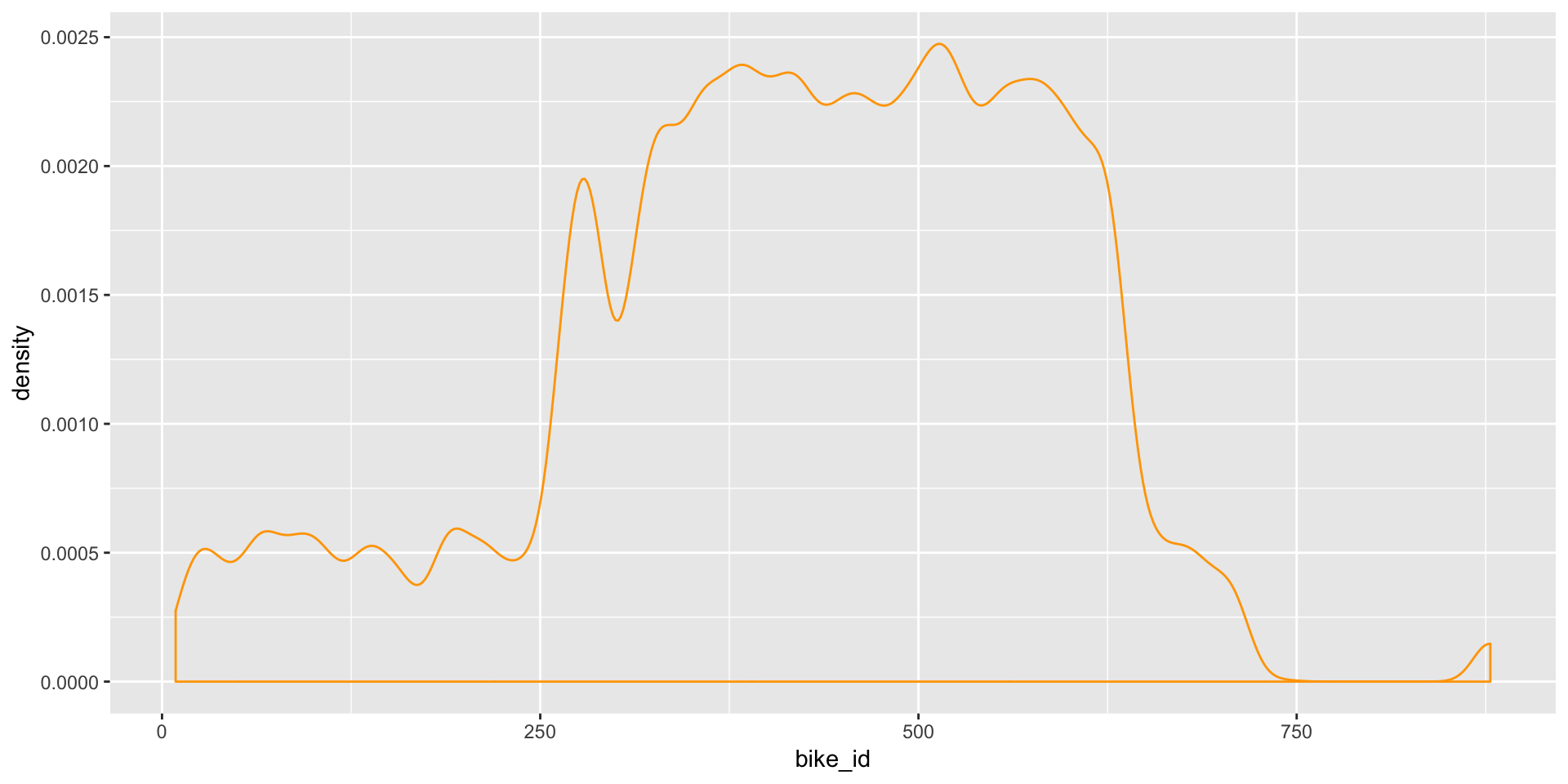
4.3. Trips between stations
Where do people travel?
The number of trips between each pair of stations was analysed.
- We have identified top 50 routes and have marked them with Red lines, rest with Yellow lines.
- Some trips start and end at the same station. Such trips cannot be captured in the map. So, we have identified top 20 such stations where most trips start and end and have marked them Red, and rest White.
Interesting result:- there have been trips between stations from San Francisco and San Jose, which are almost 50 miles apart!
trips_between <- tripFinal%>% group_by(source_lat,source_long,dest_lat,dest_long)%>%
  summarise(trips=n())

# getting names of the source and destination stations based on their geographical co-ordinates

trips_betweenStations<-sqldf('select s.name as source,t.* from station s inner join trips_between t
                            on s.lat=t.source_lat and s.long=t.source_long')

trips_betweenStations<-sqldf('select s.name as dest,t.* from station s inner join trips_betweenStations t
                            on s.lat=t.dest_lat and s.long=t.dest_long')
trips_betweenStations<-filter(trips_betweenStations,source==dest)
trips_betweenStations<-arrange(trips_betweenStations,desc(trips))

# List of top 20 stations where most of the trips start and end

trips_betweenStations<-trips_betweenStations[1:20,]

# list to top 50 routes

trips_betweenSorted<-arrange(trips_between,desc(trips))
trips_betweenSorted<-trips_betweenSorted[1:50,]

# Plotting all the layers in the map

leaflet(data = station) %>%addTiles() %>%addProviderTiles("CartoDB.DarkMatter") %>%
  addPolylines(lat=c(trips_between$source_lat, trips_between$dest_lat),
               lng=c(trips_between$source_long, trips_between$dest_long),
               color="#99FF99",
               weight=1,fillOpacity = 0.1)%>%
  addPolylines(lat=c(trips_betweenSorted$source_lat, trips_betweenSorted$dest_lat),
               lng=c(trips_betweenSorted$source_long, trips_betweenSorted$dest_long),
               color="Red",
               weight=1,fillOpacity = 0.5)%>%
  addCircleMarkers(~station$long, ~station$lat,
                   color = "White",radius=1,
                   fillOpacity = 0.2)%>%
  addCircleMarkers(~trips_betweenStations$source_long, ~trips_betweenStations$source_lat,
                   color = "Red",radius=1,
                   fillOpacity = 0.1)
4.4. Weather
The purpose of this analysis is to find out if the cities under analysis have significantly different weather patterns which could be the reason for different rates of service usage among cities. Answering this question will help us understand if the weather plays any role in the way people avail bike share service.
For this analysis, we compare the cities with respect to their average temperature, humidity, wind speed, precipitation and the crucial weather events.
From the analysis of below graphs, it is evident that these cities do not significantly differ in terms of weather patter. Thus, different numbers of trips in these cities cannot be attributed to the weather pattern. We need more analysis.
#head(weather)
ggplot(data = weather,aes(x = date,y = mean_temperature_f,color=mean_humidity))+geom_jitter(alpha=1/2)+
  xlab("Date")+ylab("Mean Temperature")+facet_wrap(~city)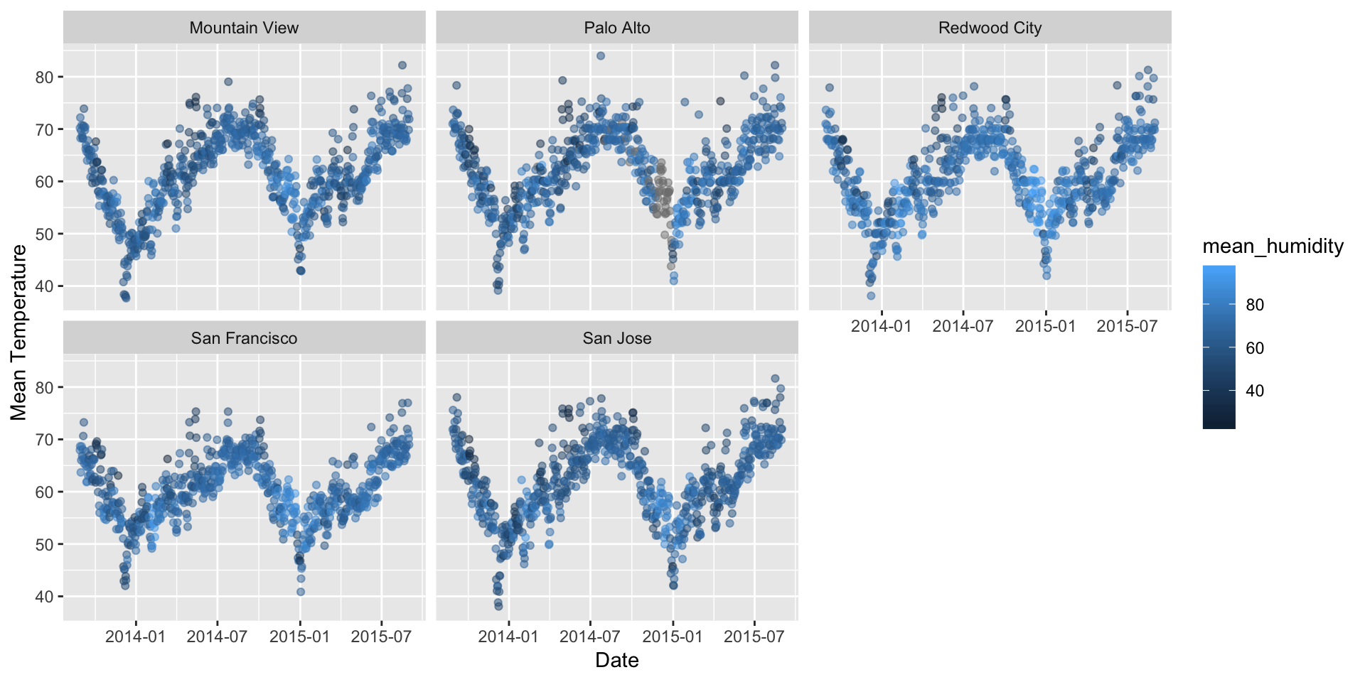
ggplot(data = weather,aes(x = date,y = mean_wind_speed_mph,color=precipitation_inches))+geom_jitter(alpha=1/4)+
  xlab("Date")+ylab("Wind Speed in mph")+facet_wrap(~city)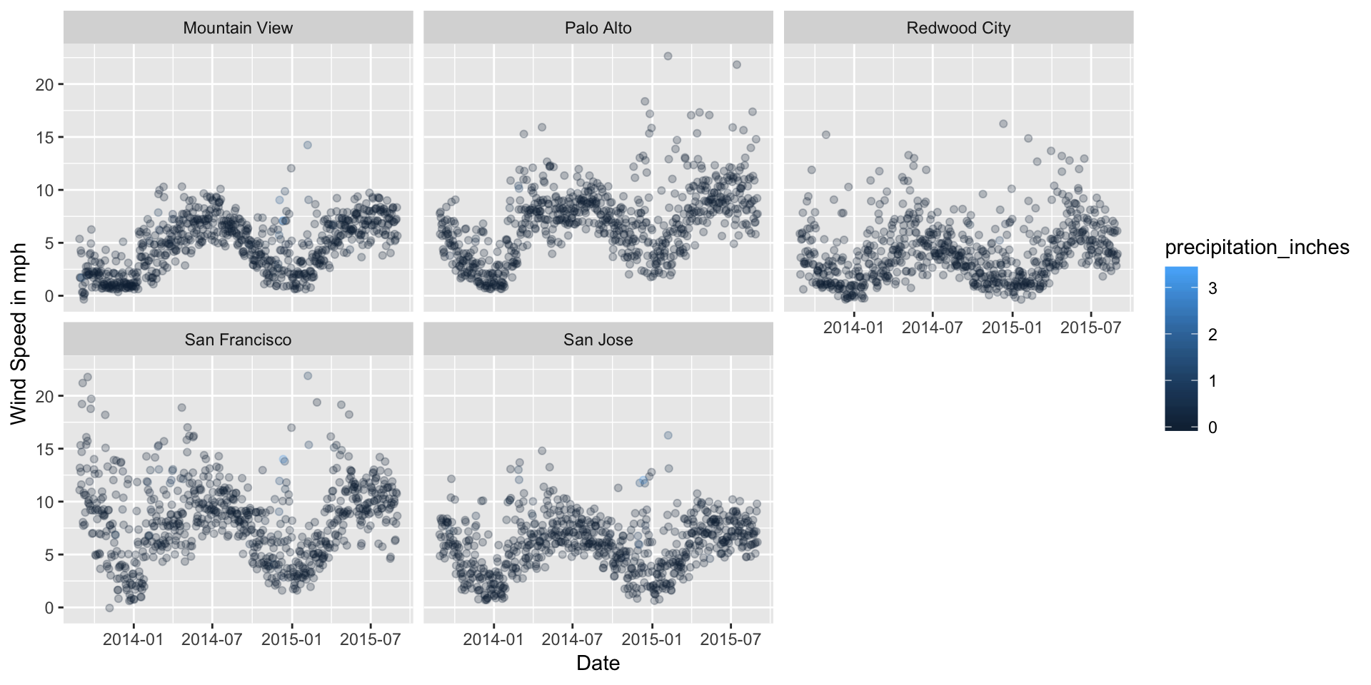
p<-weather%>%count(events, city) %>%
  plot_ly(x = ~events, y = ~n, color = ~city)%>%
  layout(title = "Events by cities",
         xaxis = list(title="Weather Events"),
         yaxis = list(title="Frequency"))
p
4.5. Status of each station
In this analysis, we will analyse the utilization of each station during peak and non-peak hours. For this, we have defined Station Utilization Factor as KPI. This is calculated as the percentage of bikes being rented on an average for each station. Different colour codes as used for different utilization factors, Green for underutilized stations and shades of Red for over-utilized ones. Darker Red represents over-utilization. Hovering on the stations reveals the name and the utlization for that station.
1. General Utilization
This is the map of stations according to their average utilization over the three years.
# defined utilization factor and summarized data based on utilization factor

stationGenUtilization<-status%>%group_by(station_id)%>%
  summarise(PercentUtilization=(mean(docks_available/(docks_available+bikes_available))))
stationGenUtilization$PercentUtilization<-round(stationGenUtilization$PercentUtilization*100,2)

# getting station name,latitude and longitude based on station id

stationGenUtilization<-sqldf('select stationGenUtilization.*,station.name,station.lat as lat,station.long as long,station.city from stationGenUtilization
                  inner join station where stationGenUtilization.station_id = station.station_id')

leaflet(data = stationGenUtilization) %>% addProviderTiles("CartoDB.DarkMatter") %>%
  addCircleMarkers(~long, ~lat, radius = 4,
                   color = ifelse(stationGenUtilization$PercentUtilization<"50", "#66ff66",
                                  ifelse(stationGenUtilization$PercentUtilization<"60", "#ffb2b2", "#ff6666")),
                   fillOpacity = ifelse(stationGenUtilization$PercentUtilization<"50", 0.2,
                                        ifelse(stationGenUtilization$PercentUtilization<"60", 0.5, 0.7)),
                     weight=2,label =paste0('(',stationGenUtilization$PercentUtilization,'%) ',stationGenUtilization$name))
2. Peak Utilization
From the analysis of trips, we have seen that the maximum trips take place between 6:00 to 12:00 and 16:00 to 20:00 hrs on weekdays. Thus, we calculate the percentage utilization of each of the stations on these peak hours on weekdays and plot the map. We can see that the utilization has increased on average and particularly in San Francisco area.
# slicing data based on busy hours on weekdays

statusNew<-filter(status,((strftime(status$time, format="%H %M")>"06:00")&
                            (strftime(status$time, format="%H %M")<"16:00")))
statusNew<-filter(status,((strftime(status$time, format="%H %M")>"12:00") &
                            (strftime(status$time, format="%H %M")<"20:00")))
statusNew$day<-format(statusNew$time, "%u") %in% c(6, 7)
statusNew2<-filter(statusNew,!statusNew$day)


stationPeakUtilization<-statusNew2%>%group_by(station_id)%>%
  summarise(PercentUtilization=(mean(docks_available/(docks_available+bikes_available))))

stationPeakUtilization$PercentUtilization<-round(stationPeakUtilization$PercentUtilization*100,2)

# getting station name,latitude and longitude based on station id

stationPeakUtilization<-sqldf('select stationPeakUtilization.*,station.name,station.lat as lat,station.long as long,station.city from stationPeakUtilization
                             inner join station where stationPeakUtilization.station_id = station.station_id')


#color coding each utilization factor

leaflet(data = stationPeakUtilization) %>% addProviderTiles("CartoDB.DarkMatter") %>%
  addCircleMarkers(~long, ~lat, radius = 5,
                   color = ifelse(stationPeakUtilization$PercentUtilization<"50", "#66ff66",
                                  ifelse(stationPeakUtilization$PercentUtilization<"60", "#ffb2b2",
                                         ifelse(stationPeakUtilization$PercentUtilization<"70", "#ff6666","#ff0000"))),
                   fillOpacity = ifelse(stationPeakUtilization$PercentUtilization<"50", 0.2,
                                        ifelse(stationPeakUtilization$PercentUtilization<"60", 0.5,
                                               ifelse(stationPeakUtilization$PercentUtilization<"70", 0.5, 1.0))),
                   weight=2,label =paste0('(',stationPeakUtilization$PercentUtilization,'%) ',stationPeakUtilization$name))
3. Special Attention to San Francisco
We take a closer look at San Francisco stations. We can identify following three stations marked Red that have maximum utilization-
- Embarcadero at Vallejo
- Commercial at Montgomery
- 2nd At Folsom
Bikes should be moved to the above stations during peak hours-
stationPeakUtilization<-filter(stationPeakUtilization,stationPeakUtilization$city=="San Francisco")


leaflet(data = stationPeakUtilization) %>% addProviderTiles("CartoDB.DarkMatter") %>%
  addCircleMarkers(~long, ~lat, radius = 5,
                   color = ifelse(stationPeakUtilization$PercentUtilization<"50", "#66ff66",
                                  ifelse(stationPeakUtilization$PercentUtilization<"60", "#ffb2b2",
                                         ifelse(stationPeakUtilization$PercentUtilization<"70", "#ff6666","#ff0000"))),
                   fillOpacity = ifelse(stationPeakUtilization$PercentUtilization<"50", 0.2,
                                        ifelse(stationPeakUtilization$PercentUtilization<"60", 0.5,
                                               ifelse(stationPeakUtilization$PercentUtilization<"70", 0.5, 1.0))),
                   weight=2,label =paste0('(',stationPeakUtilization$PercentUtilization,'%) ',stationPeakUtilization$name))
5. Impact of weather
For this analysis, we consider only data with no missing values of the previously created trip analysis dataset that contains weather data and corresponding trips count for the day. We find the correlation coefficient of each of the variable with the trip count.
As we can see, none of the variables has a significant impact on the number of trips taken by riders. We need to consider time series and seasonal variations, or any other factor to predict the number of trips.
tripComplete<-tripAnalysis[complete.cases(tripAnalysis),]

#Removing non numeric columns
tripComplete$date<-NULL
tripComplete$events<-NULL
tripComplete$city<-NULL
tripComplete$day<-NULL
correlationMatrix<-cor(tripComplete)
colmat<-as.data.frame(correlationMatrix[,1])
colnames(colmat)<-paste("Correlation Coefficient with DailyTrips")
colmat<-arrange(colmat,desc(colmat$`Correlation Coefficient with DailyTrips`))
datatable(colmat)
6. Station & Trips
We have observed that weather does not have a significant impact on the number of trips. Also, general utilization factor is also roughly same for all the cities. I have started suspecting that the number of trips has something to do with the number of stations in the city. We try to analyse this relationship-
p1<-ggplot(data=station,aes(x = city))+geom_bar(stat="Count")+xlab("City")+ylab("Stations")
p2<-ggplot(data = tripFinal,aes(x = city))+geom_bar(stat = "Count")+xlab("City")+ylab("Trips")
grid.arrange(p1,p2,ncol=2)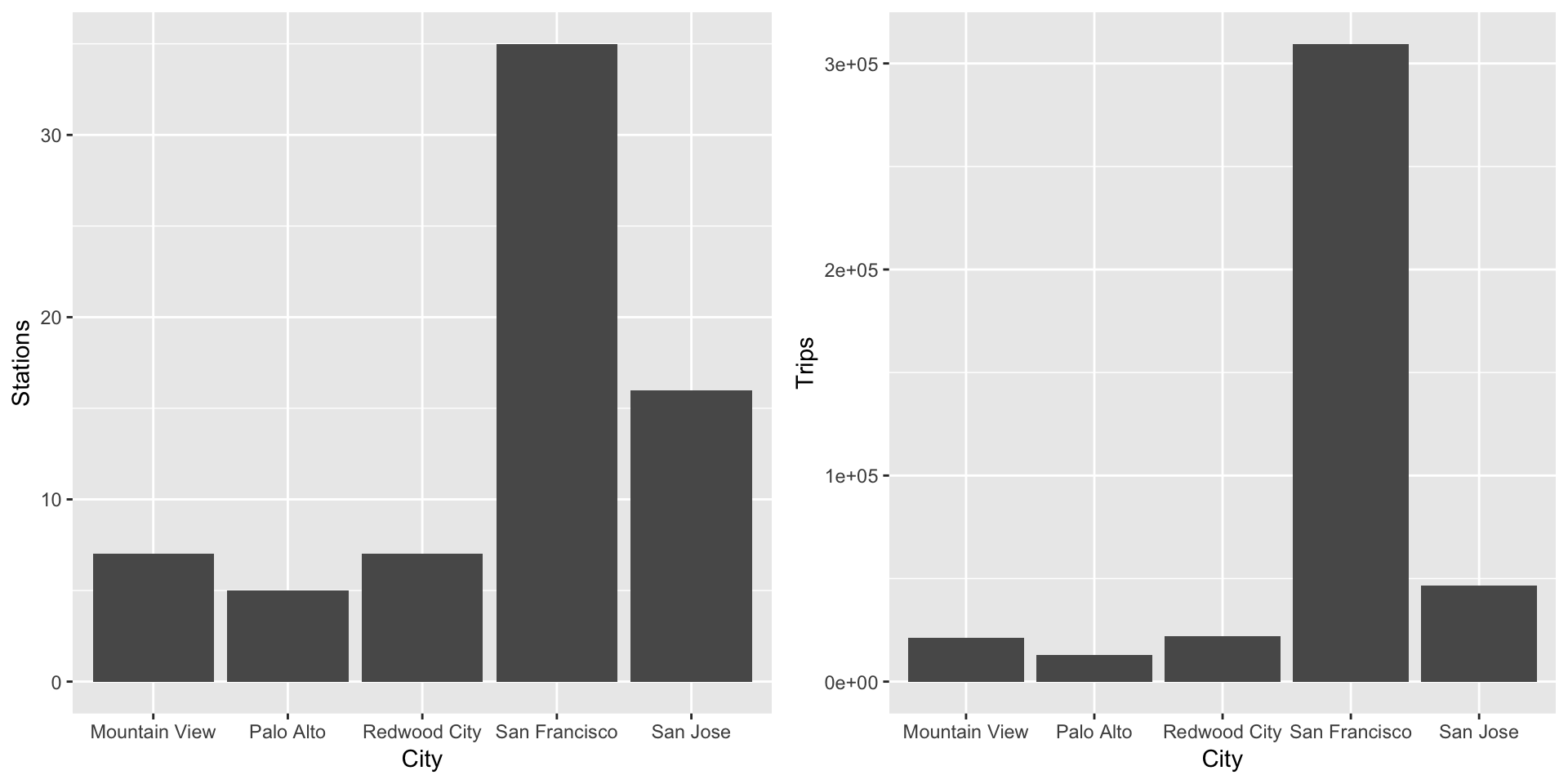
As we can see, the pattern of both the plots looks similar, indicating a direct relation between the number of stations and the trips in the city. We need to further analyse the relationship.
We created a separate dataset containing the number of stations and trips for each city. The correlation coefficient between station and log(trips) was found to be 0.995007, with confidence interval (0.9230536,0.9996870) and p-value=0.0004232, indicating that they are highly correlated. We plot number of stations against \(log(trips)\) to get an almost linear relationship.
TripCountAnalysis<-tripFinal%>%group_by(city)%>%summarise(trips=n())
b<-station%>%group_by(city)%>%summarise(stations=n())
TripCountAnalysis<-merge(TripCountAnalysis,b,key='city')
cor.test(TripCountAnalysis$stations,log(TripCountAnalysis$trips))
##
## Pearson's product-moment correlation
##
## data: TripCountAnalysis$stations and log(TripCountAnalysis$trips)
## t = 17.265, df = 3, p-value = 0.0004234
## alternative hypothesis: true correlation is not equal to 0
## 95 percent confidence interval:
## 0.9230267 0.9996868
## sample estimates:
## cor
## 0.9950052ggplot(data = TripCountAnalysis,aes(x = trips,y = stations))+geom_point()+scale_x_continuous(trans = "log")+geom_smooth(method = lm)+xlab('Log-Number of Trips')+ylab('Number of stations')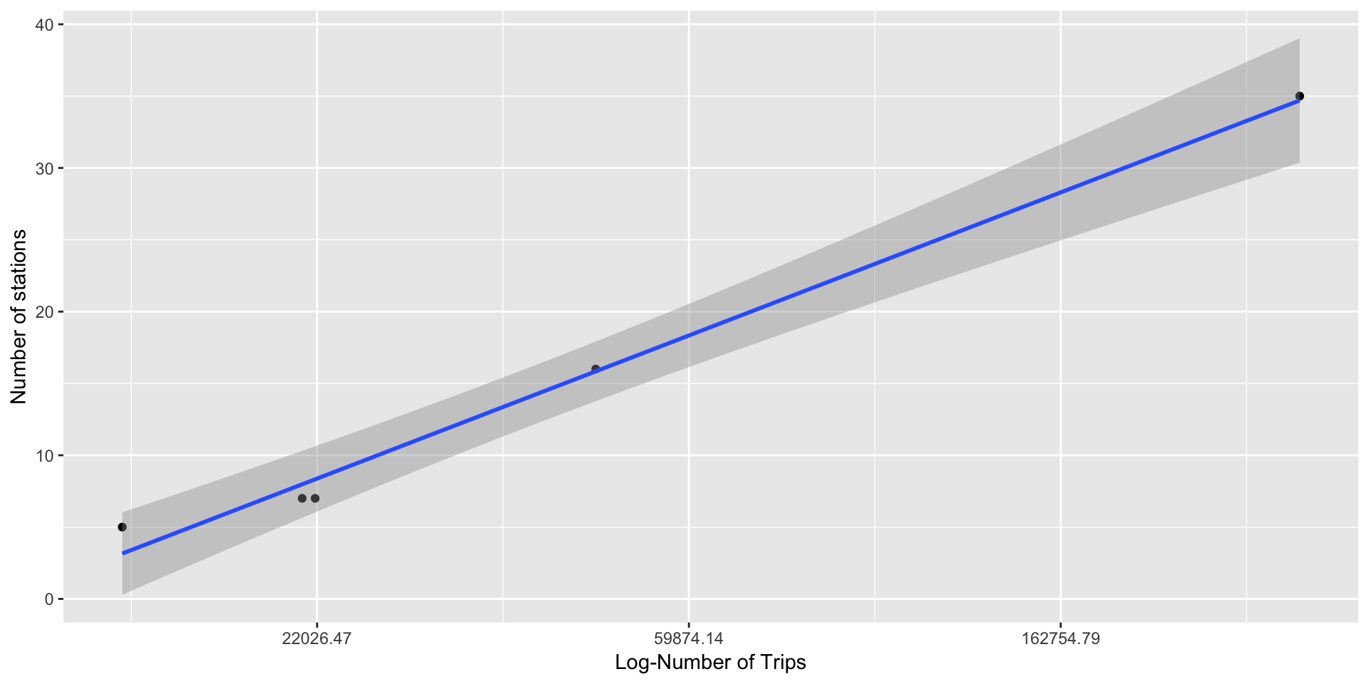
7. Linear Regression
Now, we run linear regression on the data to verify the relationship-
model<-lm(data = TripCountAnalysis,log(trips)~stations)
summary(model$residuals)
## Min. 1st Qu. Median Mean 3rd Qu. Max.
## -0.193896 -0.013900 -0.009382 0.000000 0.091173 0.126005We get Adjusted R-squared: 0.9867 which is very high. Also, the p-value: 0.0004234 indicating that the regression model is statistically significant. The residuals have mean=0 and are almost normally distributed.
Voilà! We have solved the puzzle! It’s the number of stations per city that really does impact the number of trips people take.
The regression equation for the number of trips is-
\(trips=e^{9.172774+0.099410*Stations}\)
summary(model)##
## Call:
## lm(formula = log(trips) ~ stations, data = TripCountAnalysis)
##
## Residuals:
## 1 2 3 4 5
## 0.091173 -0.193896 0.126005 -0.009382 -0.013900
##
## Coefficients:
## Estimate Std. Error t value Pr(>|t|)
## (Intercept) 9.172774 0.103132 88.94 3.13e-06 ***
## stations 0.099410 0.005758 17.27 0.000423 ***
## ---
## Signif. codes: 0 '***' 0.001 '**' 0.01 '*' 0.05 '.' 0.1 ' ' 1
##
## Residual standard error: 0.1438 on 3 degrees of freedom
## Multiple R-squared: 0.99, Adjusted R-squared: 0.9867
## F-statistic: 298.1 on 1 and 3 DF, p-value: 0.00042348. Tableau Visualization
It will be interesting to find out if the daily number of trips that start at each station change over time. This can be achieved by designing following Tableau visualization-
We see that there does not seem to be any periodic pattern in the number of trips that start at each station.
9. Business Recommendations
This has been an interesting analysis as we have found of interesting facts from the data. We have
- Found peak and off-peak hours
- Number of stations has the most impact on the number of trips in the city
- Weather does not significantly differ for the cities
- Weather does not have significant impact on the number of trips
- Found out busiest stations in terms of their utilization
Recommendations to improve business and service-
- Number of weekend trips are decreasing over time. Efforts should be taken to target tourists, who usually visit the places on weekends.
- Introducing happy hours with discounted bike rents during weekends and off-peak hours and increasing the promotion of service to increase service utilization. This can result in increased revenue
- Setting up more stations in other cities to increase customer base and service utilization
- Periodically rotating the bikes among stations, as some of bikes are more used than others
- Planning bike/station maintenance activities in December as it is the month with least number of trips
- For San Francisco- Increasing the dock capacity of these stations during peak hours This can be achieved by moving bikes from underutilized nearby stations -
- From Harry Bridges Plaza to Embarcadero at Vallejo
- From Washington at Kearney to Commercial at Montgomery
- From Transbay Terminal to 2nd At Folsom
10. List of References
- Original Data at Kaggle
- Valid Zip Codes List- Zipcodestogo
- Bike Rent Information- Fordgobike/pricing
- Precipitation Code- Weather Underground
- Banner Image- Fordgobike